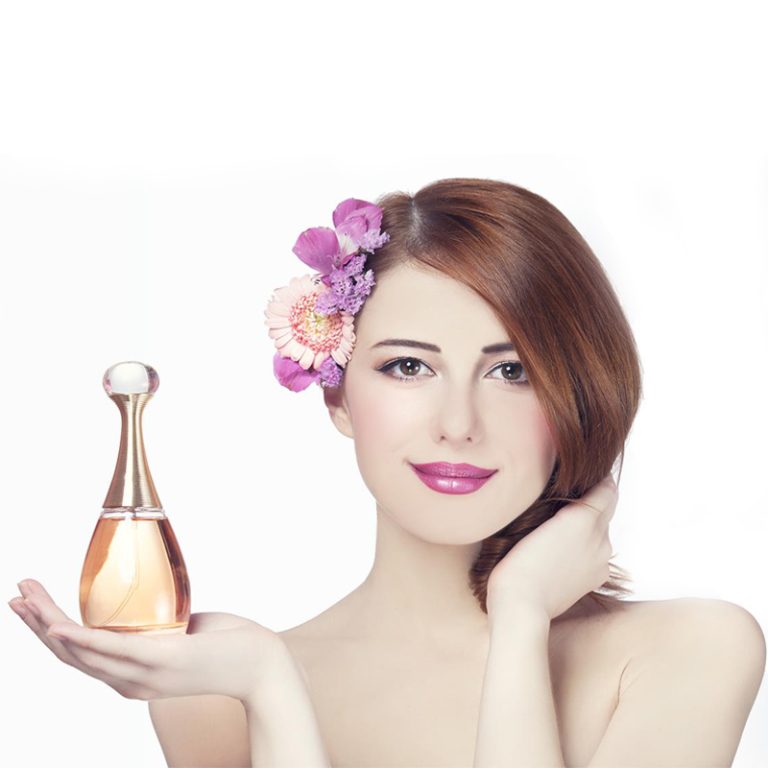
الألوان ليست فقط للعرض. في عبوات العناية بالبشرة ، تغير طريقة تفكيرك في جودة المنتج أو سلامته أو حتى سحره الخاص. سواء كنت تختار شيء من رف متجر أو تنقر على الإنترنت ، فإن لون الزجاجة يمكن أن يلمح على الفور إلى ما في الداخل.
كيف يؤثر اللون على أفكارك حول تغليف العناية بالبشرة؟
الألوان الحية مثل البرتقالي أو الوردي تبدو ممتعة وشاببة. النغمات الباردة ، مثل الأزرق أو الأخضر ، تشعر بالنظافة والسلام. التعبئة البيضاء تعني النقاء والبساطة. يبدو طازجًا ، ولهذا السبب يأتي الكثير من غسيل الوجه أو الحبر في زجاجات بيضاء أو شاحبة.
تساعد الألوان عقلك أيضًا على تنظيم المنتجات دون أن تلاحظها. غالبًا ما تستخدم مصلات الترطيب الزرقاء الماء. قد تختار كريمات مضادة للشيخوخة الأرجواني العميق أو الذهب المتوهج. بمجرد أن ترى التعبئة والتغليف ، يبدأ دماغك في تخمين ما يفعله المنتج.
ما هي المشاعر التي تثير الألوان في تصميم العناية بالبشرة؟
الألوان تثير المشاعر على الفور. الخضراء والأزرق اللطيفة تجعلك تشعر بالهدوء. إنها مثالية للمنتجات المصنوعة للبشرة الحساسة لأنها تبدو ناعمة ومستقرة.
من ناحية أخرى ، يشعر الأسود والذهب بالجرأة والأعلى. غالبا ما تظهر هذه الظلال على كريمات مكافحة الشيخوخة أو المصل الغالي. يجعلك تفكر في شيء حصري و فاخر.
ألوان ناعمة، مثل الخوخ أو اللافندر، جلب جو مريح وصحي. إنها رائعة للمرطبات التي تعد بشرة ناعمة ومرعية. يشعر الأصفر الساطع أو البرتقال مليء بالطاقة. إنها تناسب منتجات SPF للأيام النشطة في الهواء الطلق.
الألوان لا تلتقط عينك فقط. إنها تشكل كيف تشعر قبل أن تفتح المنتج.
هل يمكن أن يساعد اللون في بناء الاعتراف بالعلامة التجارية في العناية بالبشرة؟
أنت تراهن أنه يمكن! استخدام نفس الألوان عبر خط العناية بالبشرة يخلق هوية واضحة. عندما تستمر في رؤية هذه الألوان - سواء كانت لونات البيج الناعمة أو الألوان الكريمة الجريئة - تربطها بما تمثله العلامة التجارية.
تطابق الألوان والخطوط على التعبئة والتغليف يعطي مظهرا متسقا. هذا يبني الثقة. في كل مرة ترى فيها المنتج على رف أو في إعلان، تشعر بالتأكيد من العلامة التجارية.
عندما يتم إنجازه بشكل جيد ، يعمل اللون كعلامة سريعة على ما يتعلق به العلامة التجارية - مثل الجمال النظيف أو الفخامة أو الأفكار الصديقة للبيئة. يساعد العلامة التجارية على التميز في سوق مزدحمة.
ما هي الألوان الأفضل لتغليف العناية بالبشرة - ولماذا؟
لماذا الأبيض والأزرق والخضراء مثالية للجمال النظيف؟
هذه الظلال تشير إلى النقاء والشعور بالطازجة. إنها رائعة لمنظفات، الحبر، أو علاجات حب الشباب. التعبئة البيضاء سهلة العمل معها. تبدو جيدة مع ألوان أخرى أو تقف لوحدها لأسلوب عادي ونظيف. الأزرق يشير إلى الرطوبة، بينما يشير الأخضر إلى الأشياء الطبيعية في الداخل. كلاهما يشعران بالهدوء ويظهرون أن المنتج يعمل بلطف ولكن بشكل جيد.
كيف يقترح الأسود والذهب والأرجواني العميق الفخامة؟
للمصال المضادة للشيخوخة الراقية أو الكريمات الليلية، ألوان عميقة مثل الأسود أو الأرجواني مع قطع لامعة تبدو أنيقة. هذه الظلال تشعر موثوقة ودعم العلم. إنها مثالية للمشترين الأكبر سنا الذين يريدون منتجات تظهر نتائج حقيقية.
لماذا الألوان الأرضية والألوان الناعمة تناسب المنتجات الطبيعية؟
مع اهتمام الناس أكثر بالكوكب ، تشعر الظلال الأرضية بالمعنى. تصور جرات خضراء الحكمة أو زجاجات البيج مع علامات بسيطة. إضافة رسومات النباتات أو المواد الصديقة للبيئة مثل ورق الكرافت تظهر أن العلامة التجارية تحب الطبيعة. هذه الخيارات تقول بهدوء ما هو في المنتج.
لماذا يشعر البرتقال بالشباب؟
الوردي الساطع أو البرتقال المشمس يلتقط عينك بسرعة. إنهم ممتعون وودودون. هذه الألوان تعمل بشكل جيد للمشترين الأصغر سنا أو منتجات SPF مصنوعة لأساليب الحياة النشطة والمشمسة.
كيف تختار الألوان بناء على نوع المنتج؟
الألوان التي تظهر الطازجة في منظفات الوجه الحبر
غسيلات الوجه تبدو رائعة في الأبيض الساطع مع الأخضر الفاتح أو الأزرق المائي. هذه الظلال تشير إلى النقاء والتنظيف الناعم. إنها مثالية للمنتجات التي تعد بتنظيف بشرة لطيفة أو توازن.
ظلال تظهر الرطوبة والرعاية في المرطبات المصل
الباستيلات الناعمة، الأبيض الكريمي، أو البيج الهادئ تناسب منتجات ترطيب. هذه الألوان تلمح إلى الشعور الغني والرطب في الداخل. للمصال الليلية التي تنعش الجلد؟ البحرية العميقة تضيف لمسة من العمق بينما لا تزال تشير إلى الرطوبة.
النغمات التي تبني الثقة لمنتجات مكافحة الشيخوخة
منتجات مكافحة الشيخوخة غالبا ما تكلف أكثر ، لذلك تحتاج التعبئة والتغليف إلى أن تبدو تستحق ذلك. يبدو لون بورغوندي عميق مع لمسات ذهبية أنيق وقوي. تشير الأزرق الداكنة أو قطع لامعة إلى أن المنتج يعمل بشكل جيد ، وهو أمر مهم للمشترين الذين يبحثون عن نتائج.
كيف تستخدم واقيات الشمس اللون لإظهار الحماية
واقي الشمس يلمع مع ظلال مشرقة. البرتقال يذكرك بالشمس الأصفر يشعر بالحياة. كلاهما يظهران أن المنتج جاهز للمتعة في الهواء الطلق ويبدو مرحا على رفك.
كيف يجب أن تعمل الخطوط مع اختيارات الألوان الخاصة بك؟
Serif vs Sans-Serif الخطوط: أي تناسب العلامة التجارية الخاصة بك أفضل؟
يجب أن تذهب الخطوط بشكل جيد مع ألوانك ، وليس محاربتها. تساعد الخطوط الناس على تحديد علامتك التجارية وإظهار أسلوبها. خطوط سيريف تشعر المدرسة القديمة والكلاسيكية. الخطوط Sans-serif تبدو طازجة وحديثة. إذا كانت عبوتك تستخدم علامة رمادية عادية على لون أبيض ، فإن خطًا بسيطًا بدون سريف يبقيها نظيفة.
ما هي نصائح التباين التي تجعل العلامات سهلة القراءة؟
التباين الجيد يساعد النص على التميز - ضرورة لزجاجات صغيرة. يجب أن يظهر لون الخط على الخلفية. لا تستخدم النص الخفيف على خلفيات خفيفة. جرب أزواج ألوان مختلفة في أضواء مختلفة للتأكد من أن النص واضح.
كيف يمكنك اختيار الألوان لعملاء مختلفين؟
https://www.cosmepak.com/ja/product//#respond
https://www.cosmepak.com/ja/product//feed/
ما هي الألوان التي تجذب الفئات العمرية المختلفة؟
الشباب يحبون الظلال الجريئة والمشرقة. يريدون أن تشعر العناية بالبشرة بالمتعة. المشترين الأكبر سنا يفضلون الألوان الهادئة والراقية. ظلال خاتمة تجعلهم يشعرون بالاحترام في اختياراتهم.
ما هي الاتجاهات الكبيرة اليوم في تصميم عبوات العناية بالبشرة؟
لماذا التصاميم البسيطة مع المحايدة الناعمة شائعة جداً؟
التعبئة والتغليف البسيطة هي اتجاه كبير. النظيفة تبدو عالية الجودة وصادقة. إنهم يبنون الثقة بسرعة من خلال إظهار أن العلامة التجارية مفتوحة وواضحة.
كيف تضيف لوحات ذات لون واحد مع أجزاء لامعة استئناف؟
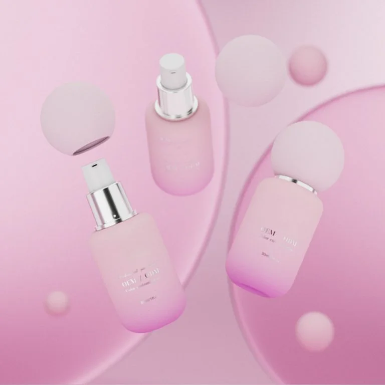
الخلفية ذات اللون الواحد ، مثل الأبيض الماتي ، مع نص الذهب الوردي ، تشعر بأنها مميزة ومكلفة. إنها طريقة بسيطة لجعل حتى المرطبات الأساسية تبدو مثل هدايا رائعة دون تغيير ما في الداخل.
لماذا الظلال الطبيعية مهمة للتغليف الصديق للبيئة؟
مع اهتمام الناس أكثر بالبيئة ، تستخدم العلامات التجارية زجاجات زجاجية معاد تدويرها في صناديق ورقية بنية أو كرافت مع حبر صديق للكوكب. تظهر هذه الخيارات أن العلامة التجارية تهتم بالأرض أكثر من مجرد الحديث.
كيف تستخدم هذه الأفكار في مجموعة منتجات Jaunce؟
دعونا نرى كيف يونس، وهي شركة رائدة في مجال تغليف مستحضرات التجميل من الصين ، تستخدم هذه الأفكار الملونة. تقدم حلول واحدة لجميع أنواع حاويات مستحضرات التجميل ، من زجاجات المصل إلى جرات الكريم. ويتضمن إعدادهم المتقدم خمسة خطوط إنتاج زجاجات زجاجية وأنظمة طلاء تلقائية ، مما يصنع 200،000 زجاجة يومياً. تحقق من زجاجات العناية بالبشرة الخاصة بهم (15 مل-150 مل جرات مستحضرات التجميل) مصممة للاتجاهات اليوم مع تلبية احتياجات مثل الحماية من الأشعة فوق البنفسجية مع الزجاج الملون.
- منظف ترطيبيستخدم تدرجات زرقاء المائية على زجاجات زجاجية متجمدة لإظهار جو جديد.
- احياء مصل الليل: يأتي في زجاجات البرقش العميقة مع ختم الفضة لشعور رائع ومتجدد.
- SPF 30 يومياًيحتوي على قبعات أصفر برتقالي حيوية لإشارة إلى حماية الشمس.
- مرطب نباتي: معبأة في جرات خضراء أرضية تظهر صيغتها القائمة على الطبيعة وقيمها الصديقة للبيئة.
استكشف مجموعة Jaunce الكاملة من زجاجات العناية بالبشرة للتصاميم التي تخلط بين الأسلوب والوظيفة.
ما هي الخطوات الذكية التي يجب أن توجه خيارات التعبئة والتغليف في المستقبل؟
لماذا مطابقة الألوان عبر المنتجات مفتاحية؟
استخدام نفس الألوان يبني الولاء. يجب على العملاء رؤية مرطبك من جميع أنحاء المتجر لأن ظله يتطابق مع مصلهم في المنزل. حافظ على الألوان الرئيسية ثابتة ولكن استخدم ظلال لهجة لإظهار ما يفعله كل منتج (على سبيل المثال، الأزرق للرطوبة).
هل يمكن للطبعات الخاصة تجربة ألوان جديدة دون الإضرار بهوية العلامة التجارية؟
نعم! الإصدارات المحدودة تتيح لك اختبار ظلال جريئة ، مثل منظف الصيف المرجاني. إذا كانت عبوتك الرئيسية تحافظ على المظهر الأبيض الأزرق المألوف ، فلن يختلط المشترون. اختبار الألوان باستخدام أبحاث السوق يساعد العلامات التجارية على العثور على أفضل الألوان.
كيف يمكن أن تعمل الاستدامة دون فقدان الأسلوب؟
استخدم المواد المعاد تدويرها مع صبغات طبيعية. جرب التشطيبات الصقيعة بدلا من الطلاء المطلي. دع النسيج يقوم بعمل الحبر الإضافي. النتيجة تبدو حديثة وصديقة للأرض.
أسئلة متكررة
Q1: ما هو أفضل مخطط لون لمصال مضاد للشيخوخة؟
ج: الأرجواني العميق مع لمسات الذهب اللامع يشير إلى الفخامة والنتائج الرائعة - مثالية لمنتجات مضادة للشيخوخة القوية.
https://www.cosmepak.com/ru/product/---/#respond
https://www.cosmepak.com/ru/product/---/feed/
Q3: هل يمكن أن تعمل الألوان الساطعة دون دفع المشترين الأكبر سنا؟
ج: نعم، ولكن خلطها مع ظلال محايدة. هذا يجعلهم يبرزون دون الشعور بالجرأة للناس الذين يريدون منتجات موثوقة.