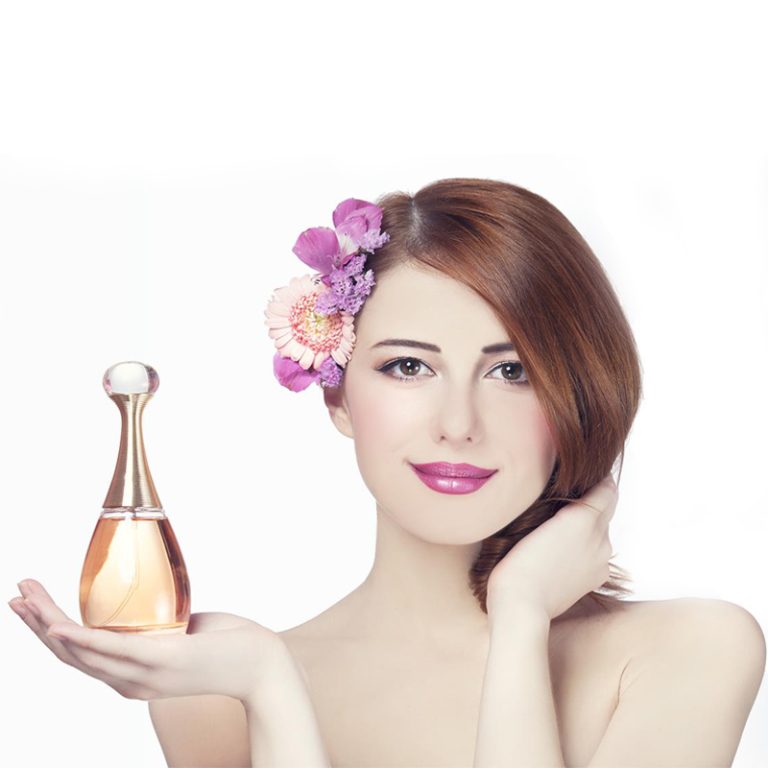
色はショーだけではない。スキンケアパッケージでは、製品の品質、安全性、または特別な魅力について考える方法を変えることができます。ショップの棚から何かを拾うか、オンラインでクリックするかどうか、ボトルの色はすぐに内部のものを示すことができます。
色はスキンケアパッケージに関するあなたの考えにどのように影響を与えますか?
オレンジやピンクのような明るい色は、楽しく若いようです。青や緑のようなクールな色は、きれいで平和な気分です。白い包装は純度とシンプルさを意味します。新鮮に見えるので、多くのフェイスウォッシュやトナーは白いボトルまたは白白白いボトルで入っています。
色は、気付かずに製品を整理するのにも役立ちます。水化血清はしばしば水性ブルースを使用します。抗老化クリームは深紫色または Sparkly ゴールドパッケージを見るとすぐ、あなたの脳は製品が何をするかを推測し始めます。
色はスキンケアデザインでどのような感情を感じますか?
色はすぐに感情を引き起こす。温柔な緑とブルーは落ち着いた気分を与える。それらは柔らかく安定しているように見えるため、敏感な肌のために作られた製品に最適です。
一方、ブラックとゴールドは大胆で最高の感じです。これらの色彩はしばしば高価な抗老化クリームや血清に表示されます。彼らはあなたに独占的でファンシーなものを考えさせます。
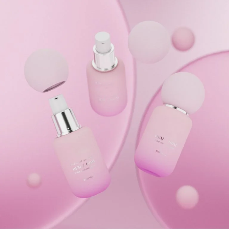
柔らかい色, 桃やラベンダーのように快適で健康的なバイブをもたらします。滑らかでケアされた肌を約束するモイシュレーザーに最適です。明るい黄色かオレンジはエネルギーに満ちている感じです。彼らはアクティブな、屋外の日にSPF製品に適しています。
色は目をつけるだけではありません。製品を開く前に、あなたがどのように感じるかを形作ります。
色はスキンケアでブランド認識を築くのに役立つのか?
賭けられる!スキンケアライン全体で同じ色を使用することは、明確なアイデンティティを作成します。柔らかいベージュ色や大胆な宝石色にかかわらず、これらの色を見続けると、ブランドが代表するものとつながります。
パッケージの色とフォントを一致させることで、一致した外観が得られます。これは信頼を築く。棚や広告で商品を見るたびに、ブランドについて確信を感じます。
うまく行われたら、色はブランドの意味を示す素早い兆候のように機能します。忙しい市場でブランドが立ち上がるのに役立ちます。
スキンケアパッケージに最適な色は、なぜですか?
なぜ白、青、緑はクリーンな美容に最適なのでしょうか?
これらの色は、純度と新鮮な感じを示唆します。それらはクリーンザー、トナー、またはアクネの治療に最適です。白い包装は簡単に使える。他の色と良く見えるか、単純でクリーンなスタイルのために一人で立っています。青色は水分を示唆し、緑色は内部の自然物を示唆します。どちらも落ち着かせると感じ、製品は軽く作動しますが、うまく動作します。
ブラック、ゴールド、ディープパープルは豪華をどのように示唆しますか?
ハイエンドの抗老化血清またはナイトクリームのために、 深い色 輝くビットを持つブラックまたは紫のようにエレガントに見えます。これらの色彩は、信頼性があり、科学に支えられていると感じます。実際の結果を示す製品を望む高齢の購入者にとって理想的です。
なぜ地球色と柔らかい色は天然製品に適しているのでしょうか?
人々が地球をより気にするにつれて、地球の色は意味を持つように感じます。シンプルなラベルを持つサージーグリーンジャーやベージュボトルを想像してください。植物図やクラフト紙のような環境に優れた材料を追加することは、ブランドが自然を愛していることを示します。これらの選択は静かに製品に含まれているものを表します。
なぜオレンジは若いと感じるのか?
明るいピンクや晴れたオレンジは目をすぐに捕まえる。楽しくてフレンドリーです。これらの色は、若い購入者や、アクティブで晴れたライフスタイルのために作られたSPF製品にとってよく動作します。
製品の種類に基づいて色を選ぶ方法は?
フレッシュさを表す色 フェイスクリーンザー&トナー
フェイスウォッシュは、軽い緑やアクワブルーで明るい白色で素晴らしいです。これらの色は純度と柔らかいクリーニングを示唆します。柔らかいスクラブやバランスの取れた肌を約束する製品に最適です。
モイシュタライザー&アンプの湿気とケアを示す色血清
柔らかいパステル,クリーム白,または冷静なベージュのスーツ保湿製品.これらの色は、内側の豊かで湿気の感じを示しています。肌を新鮮にする夜の血清?深い海軍はまだ湿気を示唆しながら深さのタッチを追加します。
抗老化製品への信頼を築くトーン
アンティエイジング製品はしばしばより高価なので、そのパッケージはそれに値するように見える必要があります。金のタッチを持つ深いボルゴンディはクラシックで強く感じます。ダークブルーや輝くビットは,製品がうまく動作することを示唆し,結果を探している購入者にとって重要です.
サンスクリンが保護を示すために色を使用する方法
サンスクリーンは明るい色で輝く。オレンジ色は日光を思い出します。黄色は生きている。両方は製品が屋外の楽しみのために準備ができており、あなたの棚で喜ばしいようです。
フォントはあなたの色の選択とどのように機能するべきですか?
Serif vs Sans-Serif Fonts: どちらがあなたのブランドに最適ですか?
フォントはあなたの色に合うべきであり、それらと戦うべきではない。フォントは、人々があなたのブランドを見つけ、そのスタイルを示すのに役立ちます。セリフフォントは古い学校と古典的な感じです。サンセリフフォントは新鮮で現代的な感じです。パッケージが白色に普通の灰色のラベルを使用する場合、シンプルなサンセリフフォントは清潔にします。
どのようなコントラストのヒントがラベルを読みやすいのでしょうか?
良いコントラストは、小さなボトルにとって必須なテキストを見出すのに役立ちます。フォントの色は背景にポップする必要があります。軽い背景に軽いテキストを使わないでください。さまざまな光で異なる色のペアを試して、テキストが明確であることを確認します。
さまざまな顧客のために色を選ぶ方法は?
ジェンダーニュートラルとジェンダー特定の色はいつ使うのか?
白いテキストの炭灰色のような中立色は、誰にも効果があります。男性の製品?ダークグリーンまたはマットブラックを選択します。実用的な感じではなく、フリルな感じです。女性のラインでは、ソフトピンクは素晴らしいですが、現代的なサンゴ色は女の子過ぎるのではなく新しい感じです。
どんな色が異なる年齢層に魅力的ですか?
若い人は大胆で明るい色が好きです。彼らはスキンケアを楽しみにしたい。高齢の買い手は、落ち着いた、ファンシーな色を好んでいます。暗い色は、彼らの選択において尊敬を感じさせます。
スキンケアパッケージデザインの現在のトレンドは何ですか?
ソフトニュートラルのシンプルなデザインはなぜこんなに人気があるのか?
シンプルな包装は大きなトレンドです。クリーンな外観は高品質で正直な感じです。ブランドがオープンで明確であることを示すことで信頼を早く築く。
シングルカラーパレットはどのように輝くビットで魅力を追加しますか?
マットホワイトのような単色の背景で、ローズゴールドのテキストが、特別で高価な感じです。基本的なモイシュレーザーでさえ、内部のものを変えずに素晴らしいギフトのように見える簡単な方法です。
なぜ自然色は環境に優しい包装に重要なのでしょうか?
人々が環境をより気にするにつれて、ブランドは地球に優しいインクを搭載したアンバーブラウンまたはクラフト紙ボックスにリサイクルされたガラスボトルを使用しています。これらの選択は、ブランドがただの話を超えて地球を気にしていることを示しています。
これらのアイデアはJaunceの製品ラインナップでどのように使用されていますか?
どのようにしてみましょう ジョーンセ中国の主要な化妆品包装プロバイダーは、これらの色のアイデアを使用しています。彼らは,血清ボトルからクリームジャーまで,あらゆる種類の化妆品容器のためのワンストップソリューションを提供しています.その先進的な設定には、5つのガラスボトル生産ラインと自動コーティングシステムが含まれており、毎日20万本のボトルを生産しています。スキンケアガラスボトル(15ml-150mlの化妆品瓶)は、今日のトレンドに合わせて設計され、紫外線保護などのニーズを満たしています。
- 水分クリーナー:フラストガラスボトルに水青のグラディエントを使用して新鮮なバイブを示します。
- ライバイブ ナイト セーラム: ファンシーな、更新する感じのための銀のスタンピングと深いプラムボトルで来ます。
- 日間SPF 30: 太陽保護の信号を与えるための明るい黄色オレンジ色の帽子を持っています。
- 植物保湿剤:自然に基づく配方と環境に優しい価値を示す土の緑の瓶に包装されています。
スタイルと機能を組み合わせるデザインのためのスキンケアガラスボトルの完全なラインナップを探索してください。
どのようなスマートなステップが将来のパッケージングの選択を指導すべきか?
なぜ製品全体の色を一致させることが重要なのでしょうか。
同じ色を使うことは忠誠心を築く。お客様は、あなたのモイチャーライザーを店の中から見つけるべきです。なぜならその影は自宅での血清と一致しているからです。主な色は安定しており,各製品の作用を示すためにアクセント色を使用します (例えば,湿気のための青色).
特別版はブランドアイデンティティを傷つけずに新しい色を試すことができますか?
ああ!限定版では、サンゴの夏のクリーンザーのような大胆な色彩をテストできます。メインパッケージがよく知られている白青の外観を維持するなら、購入者は混乱しません。市場調査による色のテストは、ブランドが最高の色を見つけるのに役立ちます。
スタイルを失わずに持続可能性はどのように機能するのでしょうか。
自然染料でリサイクルされた材料を使用します。塗装されたコーティングの代わりにフロストされた仕上げを試してください。テクスチャーは余分なインクの仕事をしましょう。その結果は現代的で地球に優しいようです。
よくあるご質問
Q1:抗老化血清のための最もよい色スキームは何ですか。
A: 輝く金色のタッチを持つ深紫色は、強い抗老化製品に最適な高高級と素晴らしい結果を示唆します。
Q2: 色のある背景でフォントが読み取れるかどうすればよいですか?
A: 背景にポップするフォントの色を選択します。テキストを明確に保つために様々なライトで異なるペアをテストします。
Q3:明るい色は古いバイヤーを押し離さずに働くことができますか。
A: はい、中立色の色合いで混ぜましょう。これは、信頼性の高い製品を望む人々にとって大胆すぎない気持ちで彼らを特徴付けます。