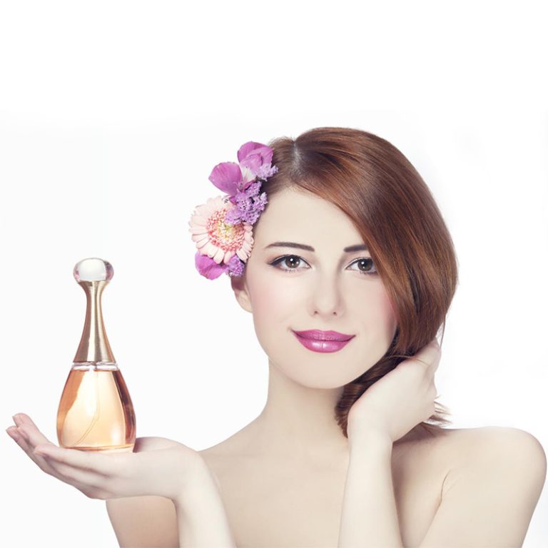
สีไม่ใช่เพียงแค่สำหรับการแสดง ในบรรจุภัณฑ์ดูแลผิว พวกเขาเปลี่ยนวิธีที่คุณคิดเกี่ยวกับคุณภาพ ความปลอดภัย หรือแม้กระทั่งความเสน่ห์พิเศษของผลิตภัณฑ์ ไม่ว่าคุณจะเลือกอะไรจากชั้นวางของร้านค้าหรือคลิกออนไลน์ สีของขวดสามารถชี้ให้เห็นสิ่งที่อยู่ภายในทันที
สีมีผลต่อความคิดของคุณเกี่ยวกับบรรจุภัณฑ์ดูแลผิวอย่างไร
สีสดใส่เช่นสีส้มหรือสีชมพูดูสนุกและหนุ่มสาว โทนเย็น เช่นสีฟ้าหรือสีเขียว รู้สึกสะอาดและสงบ บรรจุภัณฑ์สีขาวหมายถึงความบริสุทธิ์และความง่ายดาย มันดูสดใหม่ นั่นเป็นเหตุผลที่สีใบหน้าหรือโทนเนอร์มากมายมาในขวดสีขาวหรืออ่อน
สียังช่วยให้จิตใจของคุณจัดเรียงผลิตภัณฑ์โดยไม่ต้องสังเกต เซรั่มไฮเดรทมักจะใช้สีฟ้าน้ำ ครีมต้านริ้วรอยอาจเลือกสีม่วงลึกหรือ ทองคำสว่างทันทีที่คุณเห็นบรรจุภัณฑ์ สมองของคุณจะเริ่มเดาว่าผลิตภัณฑ์จะทำอะไร
สีทำให้เกิดอารมณ์อะไรในการออกแบบการดูแลผิว?
สีทำให้เกิดความรู้สึกทันที สีเขียวและสีฟ้าที่อ่อนโยนทำให้คุณรู้สึกสงบ มันเหมาะสำหรับผลิตภัณฑ์ที่สร้างขึ้นสำหรับผิวอ่อนไว้ เพราะมันดูนุ่มและมั่นคง
ในทางกลับกัน สีดำและทองคำรู้สึกกล้าหาญและยอดเยี่ยม เฉดสีเหล่านี้มักจะปรากฏบนครีมต่อต้านริ้วรอยหรือเซีรั่มที่แพง พวกเขาทำให้คุณคิดถึงอะไรที่พิเศษและแฟนซี
สีอ่อน, เช่นพีชหรือลาเวนเดอร์นำบรรยากาศที่สบายและมีสุขภาพดีมา มันเหมาะสำหรับความชุ่มชื้นที่สัญญาณผิวเรียบเนียนและดูแลผิว สีเหลืองหรือส้มสดใสรู้สึกเต็มไปด้วยพลังงาน เหมาะกับผลิตภัณฑ์ SPF สำหรับวันที่ใช้งานอยู่กลางแจ้ง
สีไม่ได้แค่จับตาของคุณ พวกเขาสร้างรูปแบบที่คุณรู้สึก ก่อนที่คุณจะเปิดผลิตภัณฑ์
สีสามารถช่วยสร้างความรู้จักของแบรนด์ในการดูแลผิวได้หรือไม่?
คุณพนันได้! การใช้สีเดียวกันในสายดูแลผิว สร้างตัวตนที่ชัดเจน เมื่อคุณเห็นสีเหล่านั้นอย่างต่อเนื่อง ไม่ว่าจะเป็นสีเบจที่นุ่ม หรือสีอัญมณีที่กล้า คุณเชื่อมต่อมันกับสิ่งที่แบรนด์หมายถึ
การจับคู่สีและแบบอักษรบนบรรจุภัณฑ์ให้รูปลักษณ์ที่สม่ำเสมอ นี่สร้างความไว้วางใจ ทุกครั้งที่คุณเห็นสินค้าบนชั้นวางหรือในโฆษณา คุณรู้สึกมั่นใจเกี่ยวกับแบรนด์
เมื่อทำได้ดี สีจะเป็นสัญญาณที่รวดเร็วสําหรับแบรนด์คืออะไร เช่น ความงามที่สะอาด ความหรูหรา หรือความคิดที่เป็นมิตรกับสิ่งแ มันช่วยให้แบรนด์โดดเด่นในตลาดที่วุ่นวาย
สีใดที่ดีที่สุดสำหรับบรรจุภัณฑ์ดูแลผิวและทำไม?
ทำไมสีขาว, สีฟ้า, และสีเขียวสมบูรณ์แบบสำหรับความงามที่สะอาด?
สีเหล่านี้แสดงความบริสุทธิ์และความรู้สึกสดใส่ พวกเขาเหมาะสำหรับสารทำความสะอาด โทนเนอร์ หรือการรักษาสิว บรรจุภัณฑ์สีขาวทำงานง่าย มันดูดีกับสีอื่น ๆ หรือยู่คนเดียวเพื่อสไตล์ที่เรียบง่ายและสะอาด สีน้ำเงินแนะนําความชื้น ขณะที่สีเขียวแนะนําสิ่งธรรมชาติภายใน ทั้งสองรู้สึกสงบและแสดงให้เห็นว่าผลิตภัณฑ์ทํางานอย่างอ่อนโยน แต่ดี
สีดำ, ทอง, และสีม่วงลึกแนะนำความหรูหราอย่างไร?
สำหรับเซีรั่มต้านริ้วรอยหรือครีมกลางคืนที่มีคุณภาพสูง สีลึก เหมือนสีดำหรือสีม่วงที่มีชิ้นส่วนประกายดูหรูหรา สีเหล่านี้รู้สึกเชื่อถือได้ และได้รับการสนับสนุนจากวิทยาศาสตร์ พวกเขาเหมาะสำหรับผู้ซื้อที่มีอายุมากกว่าที่ต้องการผลิตภัณฑ์ที่แสดงผลที่แท้จริง
ทำไมโทนและสีอ่อนถึงเหมาะกับผลิตภัณฑ์ธรรมชาติ?
ในขณะที่คนสนใจโลกมากขึ้น สีเงาโลกรู้สึกมีความหมาย ภาพขวดสีเขียวหรือขวดสีเบจด้วยฉลากง่าย ๆ การเพิ่มภาพวาดพืช หรือวัสดุที่เป็นมิตรกับสิ่งแวดล้อม เช่น กระดาษคราฟท์ แสดงให้เห็นว่าแบรนด์รักธรรมชาติ ตัวเลือกเหล่านี้บอกสิ่งที่อยู่ในผลิตภัณฑ์อย่างเงียบสงบ
ทำไมสีส้มรู้สึกเยาวชน?
สีชมพูสดใสหรือส้มแดดจับตาของคุณอย่างรวดเร็ว พวกเขาสนุกและมิตร สีเหล่านี้ทํางานได้ดีสําหรับผู้ซื้อที่น้อยกว่า หรือผลิตภัณฑ์ SPF ที่ทําสําหรับวิถีชีวิตที่แดดด
คุณควรเลือกสีตามประเภทผลิตภัณฑ์อย่างไร
สีที่แสดงความสดชื่นในสารทำความสะอาดใบหน้า & โทนเนอร์
ล้างใบหน้าดูดีในสีขาวสดใสกับสีเขียวอ่อนหรือสีน้ำเงิน เฉดสีเหล่านี้แสดงให้เห็นว่าความบริสุทธิ์และความสะอาดอ่อน มันเหมาะสำหรับผลิตภัณฑ์ที่สัญญาการล้างผิวอ่อนโยนหรือสมดุล
เงาที่แสดงความชื้นและการดูแลในครีมชื้น & เซรั่ม
พาสเทลที่นุ่ม, สีขาวครีม, หรือสีเบจที่สงบ เหมาะกับผลิตภัณฑ์ที่ช่วยให้น้ำ สีเหล่านี้หมายถึงความรู้สึกชื้นและอุดมสมบูรณ์ภายใน สำหรับเซีรั่มกลางคืนที่ช่วยให้ผิวสดชื่น? สีทะเลลึกเพิ่มความลึกในขณะที่ยังคงเห็นความชื้น
โทนที่สร้างความไว้วางใจสำหรับผลิตภัณฑ์ต่อต้านริ้วรอย
ผลิตภัณฑ์ป้องกันการริ้วรอยมักจะมีค่าใช้จ่ายมากขึ้นดังนั้นบรรจุภัณฑ์ของพวกเขาจึงต้องดูคุ้มค่ามัน สีเบอร์กันดีลึกด้วยสัมผั สีฟ้าสีเข้มหรือบิตประกายแสดงให้เห็นว่าผลิตภัณฑ์ทํางานได้ดี ซึ่งสำคัญกับผู้ซื้อที่กำลังมองหาผลลัพธ์
วิธีการกันแดดใช้สีเพื่อแสดงการป้องกัน
กันแดดสว่างด้วยเฉดสีสดใส สีส้มเตือนคุณถึงแสงแดด สีเหลืองรู้สึกสดใส่ ทั้งสองแสดงให้เห็นว่าผลิตภัณฑ์พร้อมสำหรับความสนุกกลางแจ้งและดูมีความสุขบนชั้นวางของคุณ
ตัวอักษรควรทํางานกับสีของคุณอย่างไร?
Serif vs Sans-Serif แบบอักษร: ซึ่งเหมาะกับแบรนด์ของคุณที่ดีที่สุด?
ตัวอักษรควรเข้ากับสีของคุณได้ดี ไม่ใช่ต่อสู้กับพวกเขา แบบอักษรช่วยให้คนเห็นแบรนด์ของคุณและแสดงสไตล์ของมัน แบบอักษร Serif รู้สึกเก่าและคลาสสิก แบบอักษร Sans-serif รู้สึกสดใหม่และทันสมัย ถ้าบรรจุภัณฑ์ของคุณใช้ฉลากสีเทาธรรมดาบนสีขาว ตัวอักษร sans-serif ง่ายๆ จะช่วยให้มันสะอาด
เคล็ดลับความคมชัดอะไรที่ทำให้ฉลากอ่านง่าย?
ความแตกต่างที่ดีช่วยให้ข้อความโดดเด่น เป็นสิ่งจำเป็นสําหรับขวดเล็ก ๆ สีตัวอักษรควรปรากฏบนพื้นหลัง อย่าใช้ข้อความเบาบนพื้นหลังที่เบา ลองคู่สีที่แตกต่างกันในไฟต่างๆ เพื่อให้แน่ใจว่าข้อความชัดเจน
คุณสามารถเลือกสีสำหรับลูกค้าที่แตกต่างกันได้อย่างไร
https://www.cosmepak.com/ja/product//#respond
https://www.cosmepak.com/ja/product//feed/
สีใดดึงดูดให้กับกลุ่มอายุที่แตกต่างกัน?
คนหนุ่มสาวชอบสีที่กล้าหาญและสดใส พวกเขาต้องการให้การดูแลผิวของพวกเขารู้สึกสนุก ผู้ซื้อสูงอายุชอบสีที่สงบและแฟนซี สีเงาที่เงียบง่ายทำให้พวกเขารู้สึกเคารพในทางเลือกของพวกเขา
แนวโน้มใหญ่ในปัจจุบันในการออกแบบบรรจุภัณฑ์ดูแลผิวคืออะไร?
ทำไมการออกแบบที่เรียบง่ายด้วย Soft Neutrals เป็นที่นิยมมาก?
บรรจุภัณฑ์ที่เรียบง่ายเป็นแนวโน้มที่ใหญ่ ลักษณะที่สะอาดรู้สึกคุณภาพสูงและซื่อสัตย์ พวกเขาสร้างความไว้วางใจอย่างรวดเร็ว โดยแสดงให้เห็นว่าแบรนด์เปิดและชัดเจน
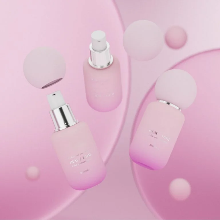
พาเลทสีเดียวที่มีบิตประกายจะเพิ่มความดึงดูดได้อย่างไร?
พื้นหลังสีเดียว เช่นสีขาว ด้วยข้อความทองคุกกุหลาบ รู้สึกพิเศษและแพง มันเป็นวิธีที่ง่ายที่จะทำให้แม้กระทั่งเครื่องชุ่มชื้นพื้นฐานดูเหมือนของขวัญที่ยอดเยี่ยมโดยไม่เปลี่ยนสิ่งที่อยู่ภายใน
ทำไมเงาธรรมชาติจึงสำคัญสำหรับบรรจุภัณฑ์ที่เป็นมิตรกับสิ่งแวดล้อม?
เมื่อผู้คนสนใจสิ่งแวดล้อมมากขึ้น แบรนด์ก็ใช้ขวดแก้วรีไซเคิลในกล่องกระดาษสีน้ำตาลหรือกระดาษคราฟท์ที่มีหมึกที่เป็นมิตรกั ตัวเลือกเหล่านี้แสดงให้เห็นว่าแบรนด์สนใจโลกมากกว่าเพียงแค่พูด
แนวคิดเหล่านี้ถูกใช้อย่างไรในผลิตภัณฑ์ของ Jaunce?
ลองดูวิธี jaunceผู้ให้บริการบรรจุภัณฑ์เครื่องสำอางชั้นนำจากจีน ใช้ความคิดสีเหล่านี้ พวกเขาให้บริการโซลูชั่นแบบครบวงจรสําหรับภาชนะเครื่องสำอางทุกชนิด ตั้งแต่ขวดเซรั่มจนถึงขวดครีม การตั้งค่าที่ก้าวหน้าของพวกเขารวมถึงสายผลิตขวดแก้ว 5 สาย และระบบเคลือบอัตโนมัติ ทำขวด 200,000 ขวดต่อวัน ดูขวดแก้วดูแลผิว (ขวดเครื่องสำอาง 15ml-150ml) ที่ออกแบบมาเพื่อตอบสนองความต้องการในปัจจุบัน
- สารทำความสะอาดไฮเดรทชั่น: ใช้สีน้ำเงินบนขวดแก้วแข็งเพื่อแสดงบรรยากาศสดใหม่
- ฟื้นฟูเซรั่มกลางคืน: มาในขวดพลัมลึกพร้อมปั๊มเงินสำหรับความรู้สึกที่แฟนซีและต่ออายุ
- SPF 30 ต่อวัน: มีหมวกสีเหลืองสีส้มที่สดใสเพื่อสัญญาณการป้องกันแดด
- Moisturizer พืชกรรม: บรรจุในขวดสีเขียวดินที่แสดงสูตรที่ใช้ธรรมชาติและคุณค่าที่เป็นมิตรกับสิ่งแวดล้อม
ค้นหาขวดแก้วดูแลผิวของ Jaunce เพื่อการออกแบบที่ผสมผสานสไตล์และฟังก์ชัน
ขั้นตอนฉลาดอะไรควรแนะนำการเลือกบรรจุภัณฑ์ในอนาคต?
ทำไมการจับคู่สีทั่วผลิตภัณฑ์เป็นสิ่งสำคัญ?
การใช้สีเดียวกันสร้างความซื่อสัตย์ ลูกค้าควรมองเห็นความชุ่มชื่นของคุณจากทั่วร้าน เพราะเงาของมันเข้ากับเซีรั่มของพวกเขาที่บ้าน ให้สีหลักมั่นคง แต่ใช้เฉดสีเน้นเพื่อแสดงสิ่งที่แต่ละผลิตภัณฑ์ทำ (เช่นสีฟ้าสำหรับความชื้น)
รุ่นพิเศษสามารถลองสีใหม่ได้หรือไม่โดยไม่ทำร้ายตัวตนของแบรนด์
ใช่! รุ่นจํากัดให้คุณทดสอบเฉดสีที่กล้าหาด เช่นสารทำความสะอาดฤดูร้อนของปะการัง หากบรรจุภัณฑ์หลักของคุณรักษารูปลักษณ์สีขาวสีน้ำเงินที่คุ้นเคย ผู้ซื้อจะไม่ได้รับการผสม การทดสอบสีด้วยการวิจัยตลาดช่วยให้แบรนด์ค้นหาสีที่ดีที่สุด
ความยั่งยืนสามารถทำงานได้อย่างไรโดยไม่สูญเสียสไตล์?
ใช้วัสดุรีไซเคิลด้วยสีย้อมธรรมชาติ ลองทาสีแทนที่จะทาสี ปล่อยให้เนื้อทำงานของหมึกเพิ่มเติม ผลลัพธ์ดูทันสมัย และเป็นมิตรกับโลก
คำถามที่พบบ่อย
Q1: รูปแบบสีที่ดีที่สุดสำหรับเซีรั่มป้องกันการริ้วรอยคืออะไร?
ตอบ: สีม่วงลึกด้วยสัมผัสทองคำที่ประกายแสดงให้เห็นถึงความหรูหราและผลลัพธ์ที่ดี - สมบูรณ์แบบสําหรับผลิตภัณฑ์ป้องกันการ
https://www.cosmepak.com/ru/product/---/#respond
https://www.cosmepak.com/ru/product/---/feed/
Q3: สีสดใสสามารถทำงานได้โดยไม่ผลักดันผู้ซื้อที่เก่าไปหรือไม่?
ตอบ: ใช่ แต่ผสมมันกับเฉดสีที่เป็นกลาง นี่ทำให้พวกเขาโดดเด่นโดยไม่รู้สึกกล้าหาญเกินไป สําหรับคนที่ต้องการผลิตภัณฑ์ที่น่าเชื่อถือ