Renkler sadece gösteri için değil. Cilt bakım ambalajlarında, bir ürünün kalitesi, güvenliği veya hatta özel cazibesi hakkında düşündüğünüzü değiştirirler. İster bir mağazanın rafından bir şey alıyorsanız ister çevrimiçi olarak tıklayorsanız, bir şişenin rengi hemen içerideki şeyi gösterebilir.
Renk Cilt Bakımı Ambalajı Düşüncelerinizi Nasıl Etkiler?
Turuncu veya pembe gibi canlı renkler eğlenceli ve genç görünüyor. Mavi veya yeşil gibi serin tonlar temiz ve huzurlu hisseder. Beyaz ambalaj saflık ve sadelik anlamına gelir. Taze görünüyor, bu yüzden birçok yüz yıkama veya toner beyaz veya soluk şişelerde gelir.
Renkler ayrıca zihninizin fark etmeden ürünleri düzenlemesine yardımcı olur. Hidratasyon serumları sıklıkla suzlu mavileri kullanır. Yaşlanma karşıtı kremler derin mor veya parlak altınlarAmbalajı gördüğünüzde beyniniz ürünün ne yaptığını tahmin etmeye başlar.
Renkler Cilt Bakımı Tasarımında Hangi Duyguları Karıştırır?
Renkler hemen duyguları doğurur. Yumuşak yeşiller ve maviler sizi sakin hissettirir. Hassas cilt için yapılan ürünler için mükemmeldirler çünkü yumuşak ve istikrarlı görünüyorlar.
Diğer yandan, siyah ve altın cesur ve üst düzey hisseder. Bu renkler genellikle pahalı yaşlanma karşıtı kremlerde veya serumlarda görünür. Sizi özel ve fantezi bir şey düşündürürler.
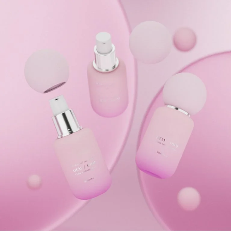
Yumuşak renkler, Şeftali veya lavanta gibiRahat, sağlıklı bir atmosfer getirin. Yumuşak, bakımlı cilt vaat eden nemlendiriciler için mükemmeldirler. Parlak sarılar veya portakal enerji dolu hisseder. Aktif, açık hava günleri için SPF ürünlerine uygundurlar.
Renkler sadece gözünüzü yakalamaz. Ürünü açmadan önce hissettiğinizi şekillendirirler.
Renk Cilt Bakımında Marka Tanınmasına Yardım Edebilir mi?
Bahse girebilirsiniz! Bir cilt bakım hattında aynı renkleri kullanmak açık bir kimlik oluşturur. Bu renkleri görmeye devam ettiğinizde - yumuşak bej veya cesur mücevher tonları olsun - onları markanın temsil ettiği şeye bağlarsınız.
Ambalajdaki renkler ve fontların eşleşmesi tutarlı bir görünüm verir. Bu güven oluşturur. Ürünü bir rafta veya bir reklamda her gördüğünüzde, markadan emin hissediyorsunuz.
İyi yapıldığında, renk markanın ne olduğu için hızlı bir işaret gibi davranır - temiz güzellik, lüks veya çevre dostu fikirler gibi. Markanın yoğun bir pazarda öne çıkmasına yardımcı olur.
Cilt Bakımı Ambalajı için Hangi Renkler En İyidir ve Neden?
Beyaz, Mavi ve Yeşiller Neden Temiz Güzellik İçin Mükemmeldir?
Bu renkler saflık ve taze bir hissi önerir. Temizleyiciler, tonerler veya sivilce tedavileri için mükemmeldirler. Beyaz ambalajla çalışmak kolaydır. Diğer renklerle iyi görünüyor veya sade, temiz bir tarz için tek başına duruyor. Mavi nem önerirken yeşil içerideki doğal şeyleri önerirken. Her ikisi de sakinleştirici hissediyor ve ürünün hafifçe ama iyi çalıştığını gösteriyor.
Siyah, Altın ve Derin Mor Lüks Nasıl Önerir?
Yüksek sınıf anti-yaşlanma serumları veya gece kremleri için, derin renkler parlak parçalarla siyah veya mor gibi zarif görünüyor. Bu renkler güvenilir ve bilim desteklenmiş hissediyor. Gerçek sonuçlar gösteren ürünler isteyen yaşlı alıcılar için idealdir.
Neden Dünya Tonları ve Yumuşak Renkler Doğal Ürünlere Uyuyor?
İnsanlar gezegeni daha çok önemsedikçe, toprak gölgeleri anlamlı hisseder. Basit etiketlerle kalısa yeşil kavanozlar veya bej şişeler düşünün. Bitki çizimleri veya kraft kağıdı gibi çevre dostu malzemeler eklemek, markanın doğayı sevdiğini gösterir. Bu seçimler sessizce üründe neler olduğunu söylüyor.
Portakal Neden Genç Hissedir?
Parlak pembe veya güneşli portakal gözünüzü hızlı yakalar. Onlar eğlenceli ve dostça. Bu renkler genç alıcılar veya aktif, güneşli yaşam tarzları için yapılmış SPF ürünleri için iyi çalışır.
Ürün türüne göre renkleri nasıl seçmelisiniz?
Yüz temizleyicilerinde tazelik gösteren renkler & Tonerler
Yüz yıkamaları açık yeşiller veya su mavileri ile parlak beyazlarda harika görünüyor. Bu renkler saflık ve yumuşak temizliği önerir. Yumuşak temizleme veya dengeli cilt vaat eden ürünler için mükemmeldirler.
Nemlendiricilerde Ne ve Bakımı Gösteren Gölgeler & Serumlar
Yumuşak pasteller, kremli beyazlar veya sakin bejler, nemlendirici ürünlere uygundur. Bu renkler içerideki zengin, nemli hissi işaret eder. Cildi canlandıran gece serumları için mi? Derin donanma, hala nem önerirken derinlik ekler.
Yaşlanma Önleyici Ürünler İçin Güven Geliştiren Tonlar
Yaşlanma önleyici ürünler genellikle daha fazla maliyete mal olur, bu yüzden ambalajlarının buna değer görünmesi gerekir. Altın dokunuşları ile derin burgonda şık ve güçlü hisseder. Koyu maviler veya parlak parçalar ürünün iyi çalıştığını gösterir, bu da sonuçlar arayan alıcılar için önemlidir.
Güneş kremleri koruma göstermek için renk nasıl kullanır
Güneş kremleri parlak renklerle parlar. Turuncu sana güneşi hatırlatıyor. Sarı canlı hissediyor. Her ikisi de ürünün açık hava eğlencesi için hazır olduğunu ve rafınızda neşeli göründüğünü gösteriyor.
Fontlar Renk Seçimlerinizle Nasıl Çalışmalı?
Serif vs Sans-Serif Fontları: Hangisi Markanıza En Uygun?
Fontlar renklerinizle iyi uymalı, onlarla savaşmamalı. Fontlar insanların markanızı fark etmelerine ve tarzını göstermelerine yardımcı olur. Serif yazı tipleri eski okul ve klasik hissediyor. Sans-serif yazı tipleri taze ve modern hissediyor. Ambalajınız beyaz üzerinde sade bir gri etiket kullanıyorsa, basit bir sans-serif yazı tipi onu temiz tutar.
Hangi Kontrast İpuçları Etiketleri Okumayı Kolaylaştırır?
İyi kontrast metinin öne çıkmasına yardımcı olur - küçük şişeler için bir zorunluluk. Font rengi arka planda görünmelidir. Hafif arka planlarda hafif metin kullanmayın. Metinin açık olduğundan emin olmak için çeşitli ışıklarda farklı renk çiftlerini deneyin.
Farklı Müşteriler için Renkler Nasıl Seçebilirsiniz?
https://www.cosmepak.com/ja/product//#respond
https://www.cosmepak.com/ja/product//feed/
Hangi renkler farklı yaş gruplarına hitap ediyor?
Gençler cesur, parlak renklere bayılırlar. Cilt bakımının eğlenceli olmasını istiyorlar. Yaşlı alıcılar sakin, fantezi renkleri tercih eder. Sessiz renkler onları seçimlerinde saygı duymalarını sağlar.
Cilt Bakımı Ambalaj Tasarımında Günümüzün Büyük Trendleri Nelerdir?
Yumuşak Nötrelerle Basit Tasarımlar Neden Bu Kadar Popülerdir?
Basit ambalaj büyük bir trend. Temiz görünüm yüksek kaliteli ve dürüst hissediyor. Markanın açık ve açık olduğunu göstererek hızlı bir şekilde güven oluştururlar.
Parlak Bitler ile Tek Renkli Paletler Nasıl Temyiz Edir?
Gezi altın metinle mat beyaz gibi tek renkli bir arka plan, özel ve pahalı hisseder. İçindeki şeyleri değiştirmeden temel nemlendiricilerin bile harika hediyeler gibi görünmesinin basit bir yoludur.
Doğal Gölgeler Çevre Dostu Ambalajlar için Neden Önemlidir?
İnsanlar çevreyi daha fazla önemsedikçe, markalar gezegen dostu mürekkeplerle amber kahverengi veya kraft kağıt kutularında geri dönüştürülmüş cam şişeler kullanırlar. Bu seçimler markanın sadece konuşmanın ötesinde dünyayı önemsediğini gösteriyor.
Bu Fikirler Jaunce Ürün Listesinde Nasıl Kullanılır?
Bakalım nasıl FahişeÇin'den önde gelen bir kozmetik ambalaj sağlayıcısı bu renk fikirlerini kullanıyor. Serum şişelerinden krema kavanozlarına kadar her türlü kozmetik konteyner için tek duraklı çözümler sunuyorlar. Gelişmiş kurulumu, günde 200.000 şişe üreten beş cam şişe üretim hattı ve otomatik kaplama sistemlerini içerir. Günümüzün trendleri için tasarlanmış Cilt Bakımı Cam Şişelerine (15ml-150ml Kozmetik Kavanozlar) göz atın, renkli camla UV koruma gibi ihtiyaçları karşılayarak.
- Hidratasyon Temizleyici: Taze bir vibe göstermek için buzlu cam şişelerde su mavisi gradiyentleri kullanır.
- Revive Gece Serumu: Fantazi, yenilenen bir hissi için gümüş damgalama ile derin huruk şişelerinde gelir.
- Günlük SPF 30: Güneş koruma sinyali için canlı sarı-turuncu kapaklara sahiptir.
- Botanik Nemlendirici: Doğa tabanlı formülünü ve çevre dostu değerlerini gösteren topraklı yeşil kavanozlarda paketlenmiştir.
Stil ve fonksiyonu karıştıran tasarımlar için Jaunce'in Cilt Bakımı Cam Şişelerinin tam serisini keşfedin.
Hangi Akıllı Adımlar Gelecekte Ambalaj Seçimlerine Rehberlik Etmeli?
Ürünler Arasında Renkler Eşlemek Neden Anahtardır?
Aynı renkleri kullanmak sadakat oluşturur. Müşteriler nemlendiricinizi mağazanın her tarafından görmelidir, çünkü gölgesi evdeki serumlarına eşleşir. Ana renkleri sabit tutun, ancak her ürünün ne yaptığını göstermek için aksan tonları kullanın (örneğin, nem için mavi).
Özel Sürümler Marka Kimliğine Zarar vermeden Yeni Renkler Deneyebilir mi?
- Evet! Evet! Sınırlı sürümler, bir mercan yaz temizleyici gibi cesur tonları test etmenize izin verir. Ana ambalajınız tanıdık beyaz-mavi görünümünü korursa, alıcılar karışmayacaklar. Piyasa araştırmaları ile renkleri test etmek, markaların en iyilerini bulmalarına yardımcı olur.
Sürdürülebilirlik Stil Kaybetmeden Nasıl Çalışabilir?
Doğal boyalarla geri dönüşümlü malzemeler kullanın. Boyalı kaplamalar yerine buzlu kaplamaları deneyin. Dokunun ekstra mürekkep işini yapmasına izin verin. Sonuç modern ve dünya dostu görünüyor.
SSS
S1: Yaşlanma karşıtı bir serum için en iyi renk şeması nedir?
C: Parlak altın dokunuşları olan derin mor, güçlü anti-yaşlanma ürünleri için mükemmel olan lüks ve harika sonuçlar önerir.
https://www.cosmepak.com/ru/product/---/#respond
https://www.cosmepak.com/ru/product/---/feed/
S3: Parlak renkler eski alıcıları uzaklaştırmadan çalışabilir mi?
A: Evet, ama onları nötr renklerle karıştırın. Bu, güvenilir ürünler isteyen insanlar için çok cesur hissetmeden öne çıkarlar.