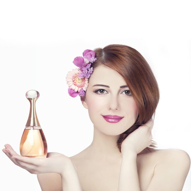
Màu sắc không chỉ dành cho show Trong bao bì chăm sóc da, chúng thay đổi cách bạn nghĩ về chất lượng, an toàn hoặc thậm chí sự quyến rũ đặc biệt của sản phẩm. Cho dù bạn đang chọn một thứ gì đó từ kệ cửa hàng hoặc nhấp vào trực tuyến, màu sắc của một chai có thể ngay lập tức gợi ý về những gì bên trong.
Màu sắc ảnh hưởng đến suy nghĩ của bạn về bao bì chăm sóc da như thế nào?
Màu sắc sống động như cam hoặc hồng có vẻ vui vẻ và trẻ trung. Các tông mát mẻ, như màu xanh lá cây hoặc xanh lá cây, cảm thấy sạch sẽ và yên bình. Bao bì trắng có nghĩa là tinh khiết và đơn giản. Nó trông tươi mới, đó là lý do tại sao nhiều chất rửa mặt hoặc mực có trong chai trắng hoặc nhạt nhạt.
Màu sắc cũng giúp tâm trí của bạn tổ chức các sản phẩm mà bạn không nhận thấy. Thần huyết thanh hydrating thường sử dụng blues nước. Kem chống lão hóa có thể chọn màu tím sâu hoặc Sparkly vàng. Ngay khi bạn thấy bao bì, não bộ của bạn bắt đầu đoán sản phẩm làm gì.
Những cảm xúc nào mà màu sắc gây ra trong thiết kế chăm sóc da?
Màu sắc gây cảm xúc ngay lập tức. Xanh xanh và xanh nhẹ nhàng làm cho bạn cảm thấy bình tĩnh. Chúng hoàn hảo cho các sản phẩm được làm cho da nhạy cảm bởi vì chúng có vẻ mềm mại và ổn định.
Mặt khác, màu đen và vàng cảm thấy táo bạo và cao cấp. Những màu sắc này thường xuất hiện trên kem chống lão hóa đắt tiền hoặc huyết thanh. Họ làm cho bạn nghĩ về một cái gì đó độc đáo và sang trọng.
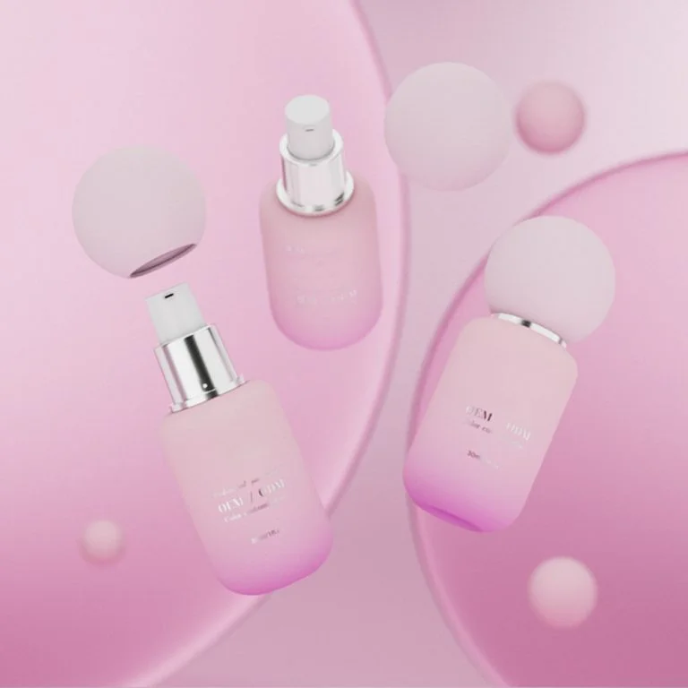
Màu sắc mềm, như đào hoặc hoa hươngmang lại một vibe ấm cúng, lành mạnh. Họ là tuyệt vời cho kem ẩm hứa hẹn mịn, chăm sóc làn da. Màu vàng sáng hoặc cam cảm thấy đầy năng lượng. Chúng phù hợp với các sản phẩm SPF cho các ngày hoạt động, ngoài trời.
Màu sắc không chỉ bắt mắt bạn. Chúng định hình cảm giác của bạn trước khi bạn mở sản phẩm.
Màu sắc có thể giúp xây dựng sự nhận biết thương hiệu trong chăm sóc da không?
Cậu đặt cược có thể! Sử dụng cùng một màu sắc trên một dòng chăm sóc da tạo ra một bản sắc rõ ràng. Khi bạn tiếp tục nhìn thấy những màu sắc đó - cho dù là màu beige mềm mại hoặc màu quý táo bạo - bạn kết nối chúng với những gì thương hiệu đại diện cho.
Phù hợp màu sắc và phông chữ trên bao bì cung cấp một cái nhìn nhất quán. Điều này xây dựng niềm tin. Mỗi khi bạn thấy sản phẩm trên kệ hoặc trong quảng cáo, bạn cảm thấy chắc chắn về thương hiệu.
Khi được thực hiện tốt, màu sắc hoạt động như một dấu hiệu nhanh chóng cho những gì thương hiệu là về - như vẻ đẹp sạch sẽ, sang trọng, hoặc ý tưởng thân thiện với môi trường. Nó giúp thương hiệu nổi bật trong một thị trường bận rộn.
Màu sắc nào tốt nhất cho bao bì chăm sóc da - và tại sao?
Tại sao màu trắng, xanh và xanh là hoàn hảo cho vẻ đẹp sạch sẽ?
Những màu sắc này cho thấy sự tinh khiết và cảm giác tươi mới. Họ là tuyệt vời cho thuốc làm sạch, mực, hoặc điều trị mụn trứng cá. Bao bì trắng rất dễ làm việc. Nó trông tốt với các màu sắc khác hoặc đứng một mình cho một phong cách đơn giản, sạch sẽ. Màu xanh cho thấy độ ẩm, trong khi màu xanh lá cây gợi ý về những thứ tự nhiên bên trong. Cả hai cảm thấy bình tĩnh và cho thấy sản phẩm hoạt động nhẹ nhàng nhưng tốt.
Làm thế nào để màu đen, vàng và màu tím sâu gợi ý sang trọng?
Đối với serum chống lão hóa cao cấp hoặc kem đêm, màu sắc sâu giống như màu đen hoặc tím với các mảnh bóng sáng trông thanh lịch. Những màu sắc này cảm thấy đáng tin cậy và được hỗ trợ bởi khoa học. Chúng là lý tưởng cho người mua lớn tuổi muốn sản phẩm cho thấy kết quả thực sự.
Tại sao màu sắc và màu sắc mềm mại phù hợp với các sản phẩm tự nhiên?
Khi mọi người quan tâm đến hành tinh này nhiều hơn, những bóng tối trái đất cảm thấy có ý nghĩa. Hình ảnh lọ xanh lá cây sage hoặc chai màu be với nhãn đơn giản. Thêm bản vẽ thực vật hoặc vật liệu thân thiện với môi trường như giấy kraft cho thấy thương hiệu yêu thiên nhiên. Những lựa chọn này lặng lẽ nói những gì có trong sản phẩm.
Tại sao cam cảm thấy trẻ?
Màu hồng tươi sáng hoặc cam nắng bắt mắt của bạn nhanh chóng. Họ vui vẻ và thân thiện. Những màu sắc này hoạt động tốt cho người mua trẻ hoặc các sản phẩm SPF được làm cho lối sống tích cực, nắng.
Làm thế nào để chọn màu sắc dựa trên loại sản phẩm?
Màu sắc cho thấy độ tươi trong chất làm sạch khuôn mặt & Toner
Rửa mặt trông tuyệt vời trong màu trắng tươi sáng với màu xanh lá cây ánh sáng hoặc màu xanh aqua. Những màu sắc này cho thấy độ tinh khiết và làm sạch mềm mại. Chúng hoàn hảo cho các sản phẩm hứa hẹn tẩy da nhẹ nhàng hoặc cân bằng.
Shades That Show Moisture and Care in Moisturizers & Serum
Pastel mềm, màu trắng kem, hoặc màu beige bình tĩnh phù hợp với các sản phẩm hydrating. Những màu sắc này gợi ý cảm giác phong phú, ẩm ướt bên trong. Đối với serum đêm làm da tươi mới? Deep Navy thêm một chút chiều sâu trong khi vẫn gợi ý độ ẩm.
Âm thanh xây dựng niềm tin cho các sản phẩm chống lão hóa
Các sản phẩm chống lão hóa thường tốn nhiều hơn, vì vậy bao bì của họ cần phải trông đáng giá. Màu burgundy sâu với vàng cảm thấy sang trọng và mạnh mẽ. Màu xanh tối hoặc bóng sáng cho thấy sản phẩm hoạt động tốt, điều quan trọng đối với người mua tìm kiếm kết quả.
Cách kem chống nắng sử dụng màu để hiển thị bảo vệ
Kem chống nắng tỏa sáng với màu sắc tươi sáng. Cam nhắc nhở bạn về ánh nắng mặt trời. Màu vàng cảm thấy sôi động. Cả hai cho thấy sản phẩm đã sẵn sàng cho niềm vui ngoài trời và trông vui vẻ trên kệ của bạn.
Phông chữ nên hoạt động như thế nào với lựa chọn màu sắc của bạn?
Serif vs Sans-Serif Fonts: Cái nào phù hợp với thương hiệu của bạn tốt nhất?
Phông chữ nên phù hợp tốt với màu sắc của bạn, không phải chống lại chúng. Phông chữ giúp mọi người phát hiện thương hiệu của bạn và thể hiện phong cách của nó. Các phông chữ serif cảm thấy cũ và cổ điển. Phông chữ Sans-serif cảm thấy tươi mới và hiện đại. Nếu bao bì của bạn sử dụng một nhãn màu xám đơn giản trên màu trắng, một phông chữ sans-serif đơn giản giữ cho nó sạch sẽ.
Những lời khuyên tương phản nào làm cho nhãn dễ đọc?
Sự tương phản tốt giúp văn bản nổi bật - một điều cần thiết cho các chai nhỏ. Màu phông chữ nên nổi lên nền. Đừng sử dụng văn bản ánh sáng trên nền ánh sáng. Hãy thử các cặp màu khác nhau trong các ánh sáng khác nhau để đảm bảo văn bản rõ ràng.
Làm thế nào để chọn màu sắc cho khách hàng khác nhau?
https://www.cosmepak.com/ja/product//#respond
https://www.cosmepak.com/ja/product//feed/
Màu sắc nào hấp dẫn các nhóm tuổi khác nhau?
Những người trẻ thích màu sắc táo bạo, tươi sáng. Họ muốn chăm sóc da của họ cảm thấy vui vẻ. Người mua lớn tuổi thích màu sắc bình tĩnh và sang trọng. Những màu sắc tắt làm cho họ cảm thấy được tôn trọng trong lựa chọn của họ.
Xu hướng lớn ngày nay trong thiết kế bao bì chăm sóc da là gì?
Tại sao các thiết kế đơn giản với trung lập mềm phổ biến đến vậy?
Đóng gói đơn giản là một xu hướng lớn. Trông sạch sẽ cảm thấy chất lượng cao và trung thực. Họ xây dựng niềm tin nhanh chóng bằng cách cho thấy thương hiệu cởi mở và rõ ràng.
Làm thế nào để bảng màu đơn với các bit bóng sáng thêm hấp dẫn?
Một nền màu đơn, như màu trắng mờ, với văn bản vàng hồng, cảm thấy đặc biệt và đắt tiền. Đó là một cách đơn giản để làm cho ngay cả kem ẩm cơ bản trông giống như những món quà tuyệt vời mà không thay đổi những gì bên trong.
Tại sao màu sắc tự nhiên quan trọng cho bao bì thân thiện với môi trường?
Khi mọi người quan tâm nhiều hơn đến môi trường, các thương hiệu sử dụng chai thủy tinh tái chế trong hộp giấy nâu hổ phái hoặc kraft với mực thân thiện với hành tinh. Những lựa chọn này cho thấy thương hiệu quan tâm đến trái đất ngoài việc chỉ nói chuyện.
Những ý tưởng này được sử dụng như thế nào trong dòng sản phẩm của Jaunce?
Hãy xem làm thế nào Jaunce, một nhà cung cấp bao bì mỹ phẩm hàng đầu từ Trung Quốc, sử dụng những ý tưởng màu sắc này. Họ cung cấp các giải pháp một cửa cho tất cả các loại chứa mỹ phẩm, từ chai huyết thanh đến lọ kem. Thiết lập tiên tiến của họ bao gồm năm dây chuyền sản xuất chai thủy tinh và hệ thống lớp phủ tự động, sản xuất 200.000 chai mỗi ngày. Kiểm tra các chai thủy tinh chăm sóc da của họ (lọ mỹ phẩm 15ml-150ml) được thiết kế cho xu hướng ngày nay trong khi đáp ứng nhu cầu như bảo vệ tia cực tím với thủy tinh màu.
- Chất làm sạch hydratingSử dụng các gradient màu xanh aqua trên chai thủy tinh đóng băng để thể hiện một tâm trạng tươi mới.
- Phục hồi Serum Đêm: Được cung cấp trong chai mì sâu với dập bạc cho một cảm giác tưởng tượng, đổi mới.
- SPF 30 hàng ngàyCó mũ màu vàng-cam sôi động để tín hiệu bảo vệ chống nắng.
- Máy ẩm thực vậtĐóng gói trong lọ xanh lá cây đất cho thấy công thức dựa trên thiên nhiên và giá trị thân thiện với môi trường.
Khám phá dòng sản phẩm đầy đủ của Jaunce về chai thủy tinh chăm sóc da cho các thiết kế pha trộn phong cách và chức năng.
Những bước thông minh nào nên hướng dẫn lựa chọn đóng gói trong tương lai?
Tại sao kết hợp màu sắc trên khắp sản phẩm là chìa khóa?
Sử dụng cùng một màu sắc xây dựng lòng trung thành. Khách hàng nên phát hiện kem ẩm của bạn từ khắp cửa hàng bởi vì bóng của nó phù hợp với huyết thanh của họ ở nhà. Giữ màu sắc chính ổn định nhưng sử dụng màu sắc giọng nói để cho thấy những gì mỗi sản phẩm làm (ví dụ: màu xanh cho độ ẩm).
Các phiên bản đặc biệt có thể thử màu sắc mới mà không làm tổn thương bản sắc thương hiệu?
Vâng! Phiên bản giới hạn cho phép bạn kiểm tra màu sắc táo bạo, như chất làm sạch mùa hè san hô. Nếu bao bì chính của bạn giữ vẻ trắng-xanh quen thuộc, người mua sẽ không bị lẫn lộn. Kiểm tra màu sắc với nghiên cứu thị trường giúp các thương hiệu tìm thấy những màu sắc tốt nhất.
Làm thế nào để làm việc bền vững mà không mất phong cách?
Sử dụng vật liệu tái chế với thuốc nhuộm tự nhiên. Hãy thử kết thúc băng thay vì sơn lớp phủ. Hãy để kết cấu làm công việc của mực bổ sung. Kết quả trông hiện đại và thân thiện với trái đất.
Câu hỏi thường gặp
Q1: Chương trình màu sắc tốt nhất cho huyết thanh chống lão hóa là gì?
A: màu tím sâu với vàng sáng cho thấy sự sang trọng và kết quả tuyệt vời - hoàn hảo cho các sản phẩm chống lão hóa mạnh mẽ.
Q2: Làm thế nào để đảm bảo phông chữ của tôi có thể đọc được trên nền màu?
A: Chọn màu phông chữ nổi lên nền. Kiểm tra các cặp khác nhau trong ánh sáng khác nhau để giữ cho văn bản rõ ràng.
Q3: Màu sắc sáng có thể hoạt động mà không đẩy người mua cũ hơn?
A: Vâng, nhưng trộn chúng với màu sắc trung lập. Điều này làm cho họ nổi bật mà không cảm thấy quá táo bạo cho những người muốn sản phẩm đáng tin cậy.